|
Typography is all about fonts, and which one you choose to represent something best. Typography is important, because before people even read whatever you write, they look at the fonts you choose. If they don't fit well together, or don't represent what you wrote, people might not even bother reading it. Each font has it's own personality, like some are fun, some are easy to read, some look fancy, etc. It's important to use the right fonts for the right words. In class, we learned about five different font types: Serif, Sans Serif, Monospaced, Script/Handwritten, and Display. A serif font could be used in a book, important document, or something else that should be easy to read. A sans serif font could be used on a website or letter. Monospaced fonts are often used in coding. Script/handwritten fonts can be used for children, fancy notes, or any other short thing. Display fonts tend to be hard to read, so they are mostly used or titles or headings. Typeface ComparisonIn the typeface comparison assignment, I had to find a font for each of the categories (serif, sans serif, monospaced, script/handwritten, and display.) I had to use some design principles, such as contrast, repetition, alignment, and proximity for this assignment to make it look nice. 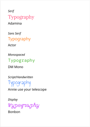 Word PortraitsFor the word portraits assignment, I had to find ten different fonts, and write one word that represents the font and one that doesn't. This helped me learn that I need to use different fonts to convey different meanings, and I began to understand how each font has its own personality. 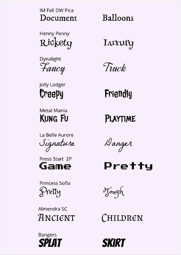
0 Comments
Leave a Reply. |
AuthorHello, my name is Mia. Look at my About Me page to learn more. Archives
November 2020
Categories
All
 This work is licensed under a Creative Commons Attribution-NonCommercial-ShareAlike 4.0 International License. |
 RSS Feed
