|
Now, in technology, we've been working on color theory. I learned about HEX codes and RGB values, and now understand colors a lot better. I used Gravit to create two different types of artwork. I used simple circle designs for both of them. For Color Names, I had to find fifteen different colors that I liked, and had to write both their RGB value and their HEX code beneath. This helped me get more familiar with both RGB and the HEX codes, and I think I understand them better now. For color schemes, I used Adobe Color to find different color schemes. Then I would use the HEX codes to put these colors on Gravit. This taught me about different color schemes (monochromatic, analogous, triadic, and complementary), and what they look like. I think both projects came out nicely. Color Names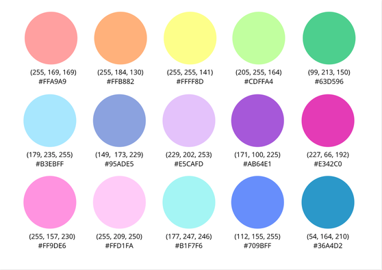 Color Schemes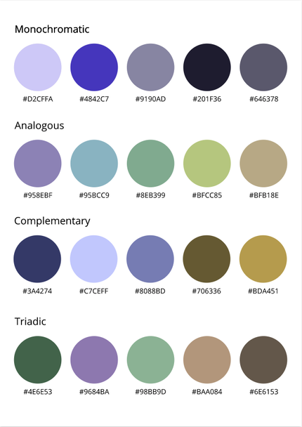
0 Comments
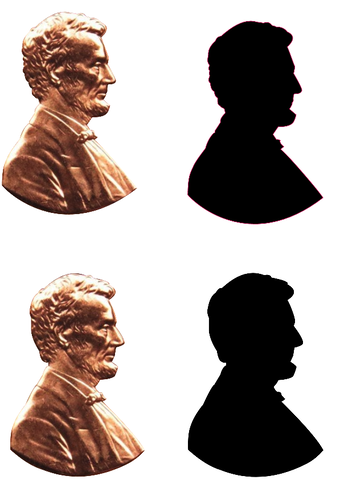
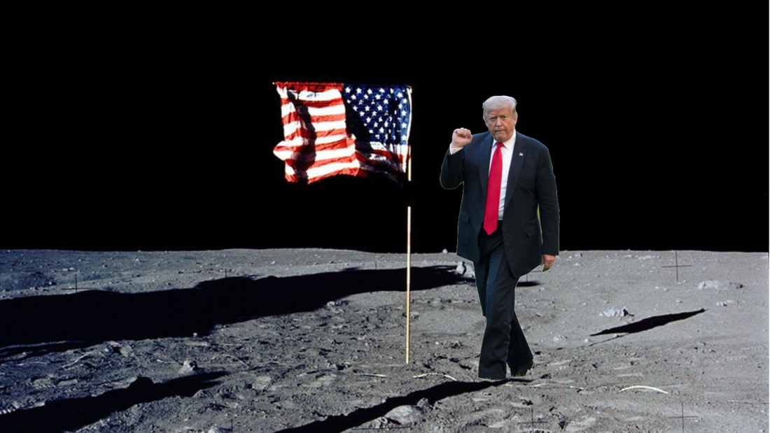
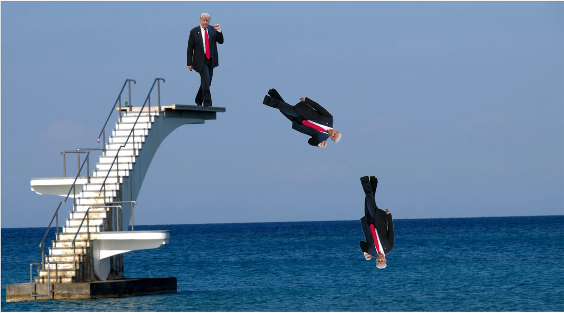
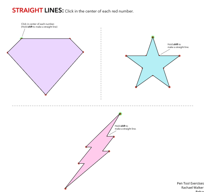
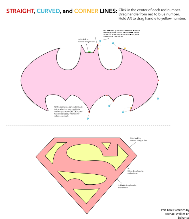
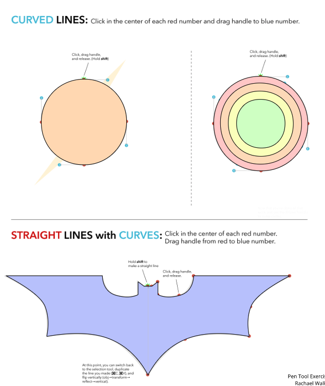
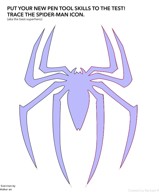
Typography is all about fonts, and which one you choose to represent something best. Typography is important, because before people even read whatever you write, they look at the fonts you choose. If they don't fit well together, or don't represent what you wrote, people might not even bother reading it. Each font has it's own personality, like some are fun, some are easy to read, some look fancy, etc. It's important to use the right fonts for the right words. In class, we learned about five different font types: Serif, Sans Serif, Monospaced, Script/Handwritten, and Display. A serif font could be used in a book, important document, or something else that should be easy to read. A sans serif font could be used on a website or letter. Monospaced fonts are often used in coding. Script/handwritten fonts can be used for children, fancy notes, or any other short thing. Display fonts tend to be hard to read, so they are mostly used or titles or headings. Typeface ComparisonIn the typeface comparison assignment, I had to find a font for each of the categories (serif, sans serif, monospaced, script/handwritten, and display.) I had to use some design principles, such as contrast, repetition, alignment, and proximity for this assignment to make it look nice. 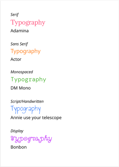 Word PortraitsFor the word portraits assignment, I had to find ten different fonts, and write one word that represents the font and one that doesn't. This helped me learn that I need to use different fonts to convey different meanings, and I began to understand how each font has its own personality. 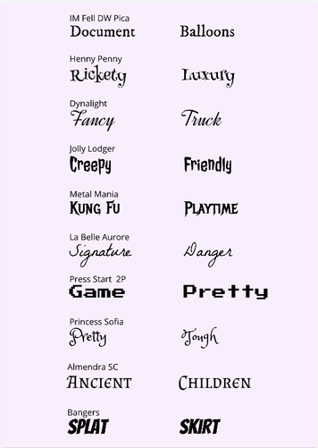 For my last couple of Technology classes, I've been working on Pen Tool Exercises, using Gravit. The pen tool is a way to make lines and create shapes. I did four superhero exercises: Straight lines, curved lines, corner lines, and a Spiderman icon challenge. These helped me learn how to use the pen tool. Then, I did a penny exercise, where I cut out Lincoln's face from the penny and made a silhouette and a cut-out. Finally, I cut out pictures using the pen tool. I made two of these images. My first one was a cut-out of Donald Trump, standing by the American flag on the moon. My other picture was this same cut-out of Donald Trump jumping off of a diving board. I chose to make these because the pictures are funny, and it looked pretty realistic. Sometimes, the pen tool was really hard to use, and I had to start all over. I struggled the most with curved and corner lines, and it took me quite a while to get used to them. This was a good project, and I'm glad with my final understanding of the pen tool.
   This is my summative shapes project, made using Gravit. This drawing is meaningful to me as this house is my summerhouse in Czech Republic that I visit each year. It's in a small village in the countryside, and the house was built sometime in the 1700s. My great great grandmother bought it from Jews, and it's been passed down in my family for many years. This house brings back many summer memories, and my family would never sell it. This project was fun to make and reminded me of all the fun I've had in this house. 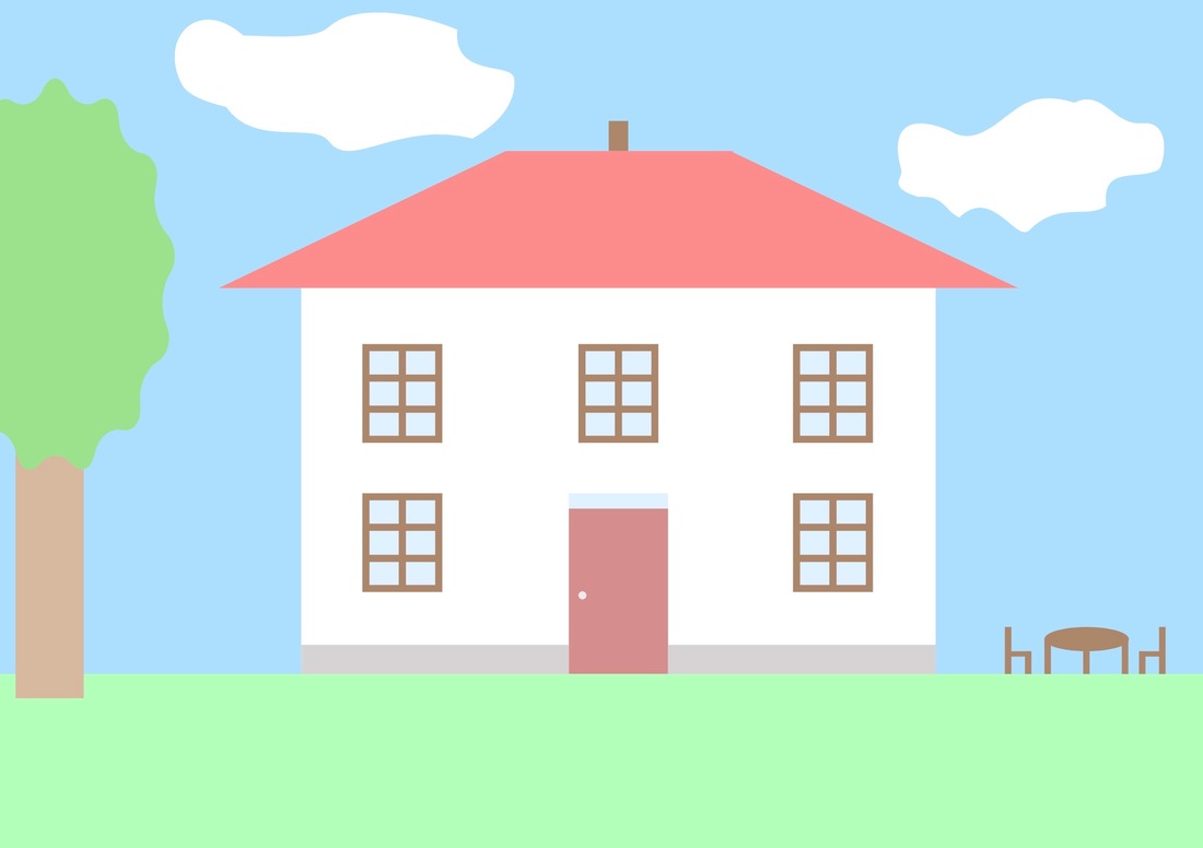 In this lesson, I learned how to modify shapes and use tools like intersect, subtract, and difference. 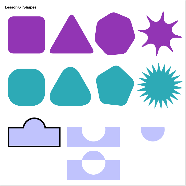 This lesson taught me how to align and group shapes in Gravit. I also learned how layers work and how to bring something forward or backward a layer. 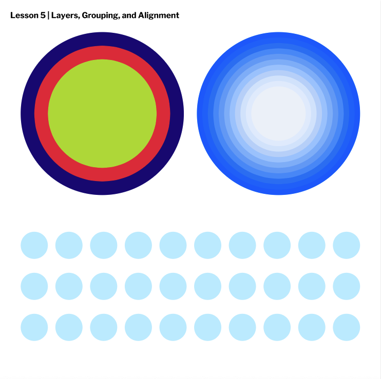 My last lesson with Gravit helped me learn to fill and border shapes. I learned how to align borders, make dashed borders, transparent fills, and more. 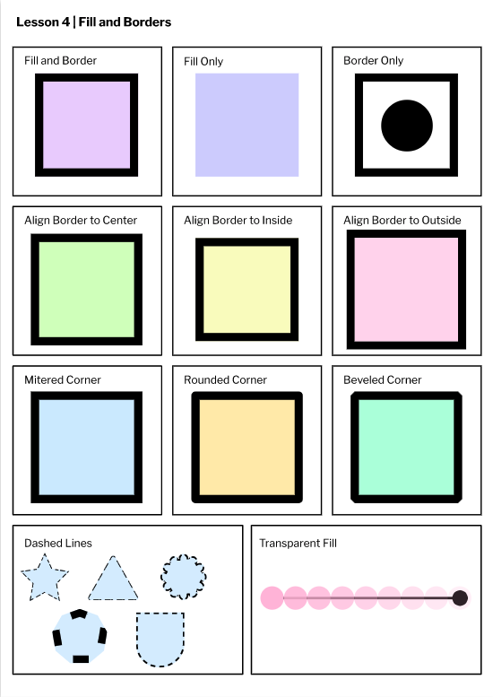 In this lesson, I learned to use tools in Gravit like shapes and lines. I learned to use the subselect and the pointer tool. I also learned to make paths. This lesson was quite fun but also took longer than the others. 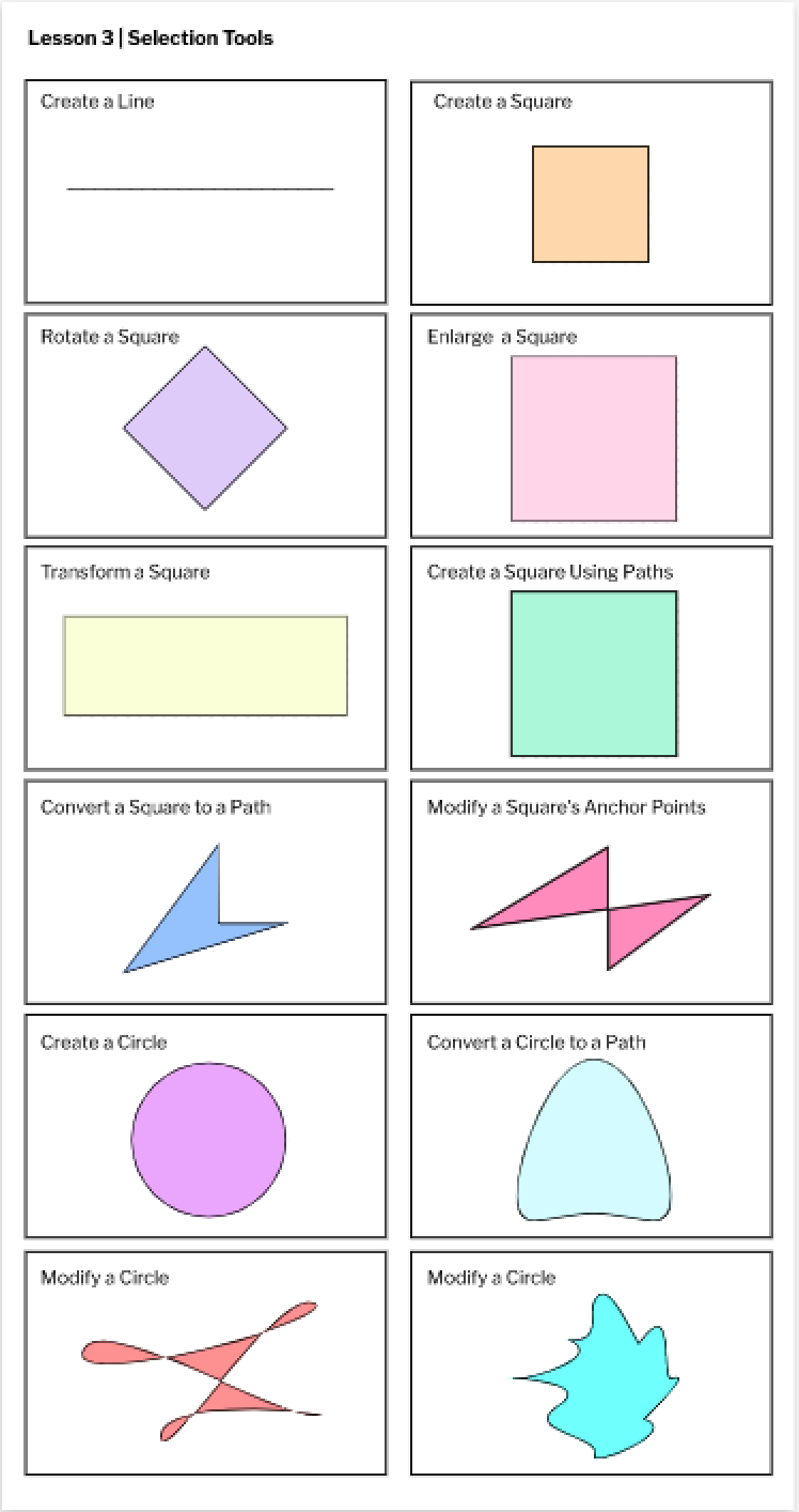 I did a project on creating pages in Gravit. I made four pages, custom, A4, A3, and Blog Cover. I gave each a different color, and used a font I picked out myself. It was interesting to use a new program for all of this. 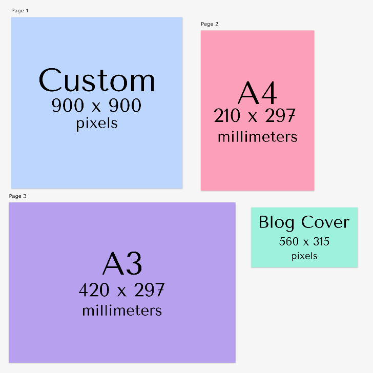 A technology project I made recently was a self-portrait using Javascript on Khan Academy. I learned the commands for lots of shapes, colors, strokes, and much more. It was a fun project, but quite time-consuming and a little bit frustrating, at times. My shapes had to be positioned correctly and had to be the right size, for which I used numbers as coordinates. It was hard to guess the correct numbers, and I always had to go back and edit. Click here to check out the Khan Academy tutorials yourself! 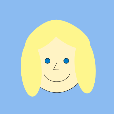 Here is my code:
background (150, 196, 245); //head fill(255, 244, 201); ellipse(200, 200,220,250); //eyes fill(0, 136, 209); ellipse(233,214,18,18); ellipse(167,214,18,18); //nose line(188,244,200,221); line(188,244,207,243); //mouth noFill(); arc(200, 250, 94, 74, 16, 164); //hair fill(255, 246, 145); stroke(255, 246, 145); rotate(-38); ellipse(43,192,152,68); rotate(69); ellipse(272,-22,162,68); rotate(56); ellipse(249,-97,190,-72); rotate(358); ellipse(258,-278,190,-72); |
AuthorHello, my name is Mia. Look at my About Me page to learn more. Archives
November 2020
Categories
All
 This work is licensed under a Creative Commons Attribution-NonCommercial-ShareAlike 4.0 International License. |
 RSS Feed
